Teamed up with developers and accessibility specialists to build a design system from scratch and modernize product workflows at an ed-tech company.
W. W. Norton develops a variety of education products, from student-facing homework apps to instructor-facing class management systems.
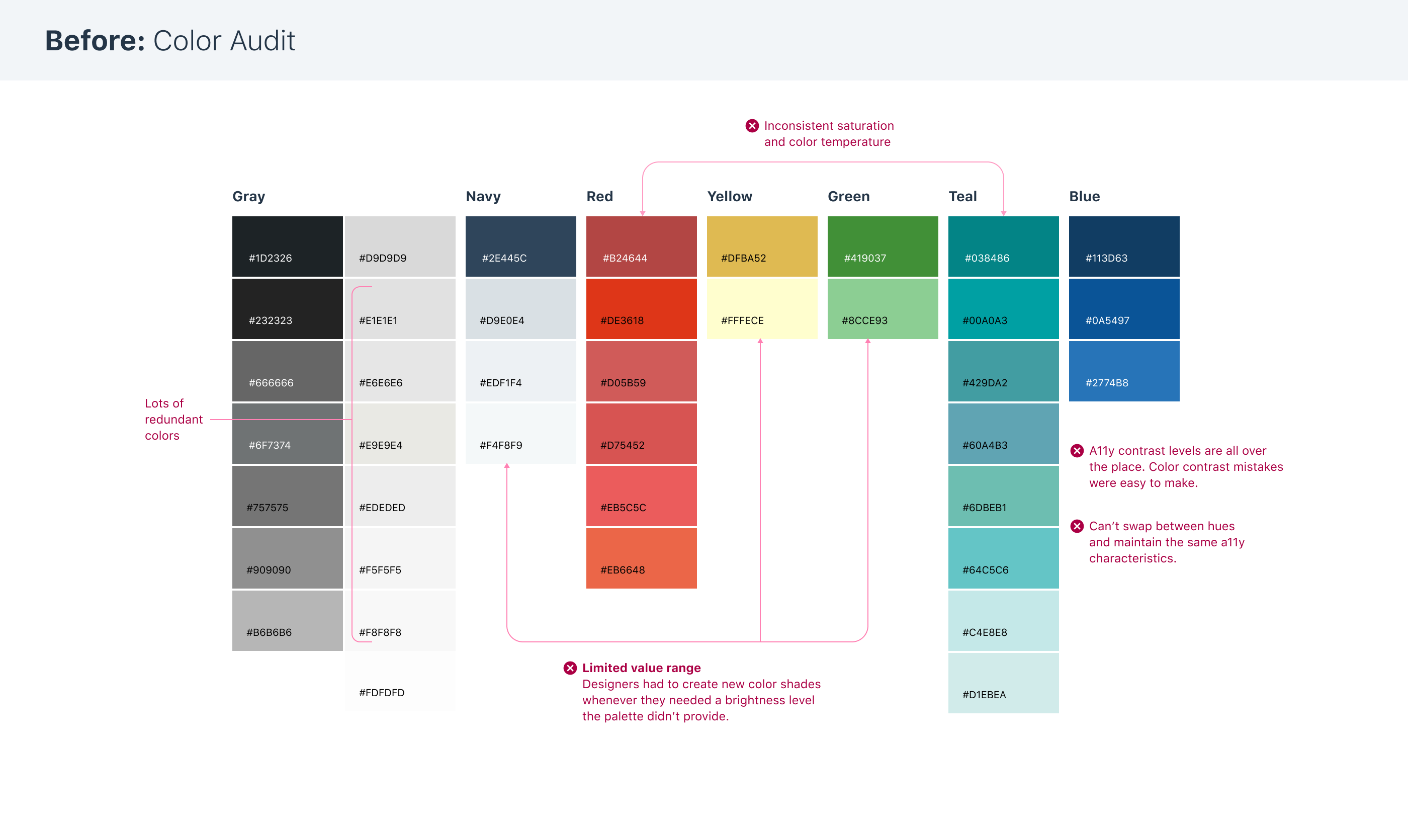
As Norton's edtech product portfolio grew, it faced all the problems organizations typically do when they don’t have a design system: siloed teams doing duplicate work, high overhead, inconsistent UX, and needless accessibility oversights.
So I partnered with developers and accessibility specialists to build the Norton Design System (NDS).
As Lead Product Designer, my responsibilities include:
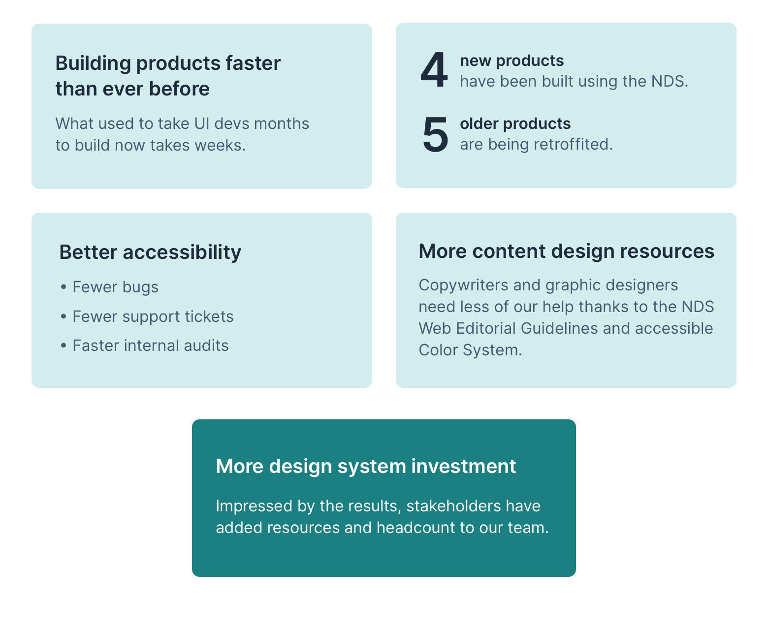
The has been used in every new Norton product since launch. There's still a lot of work to do, but the results have been dramatic.
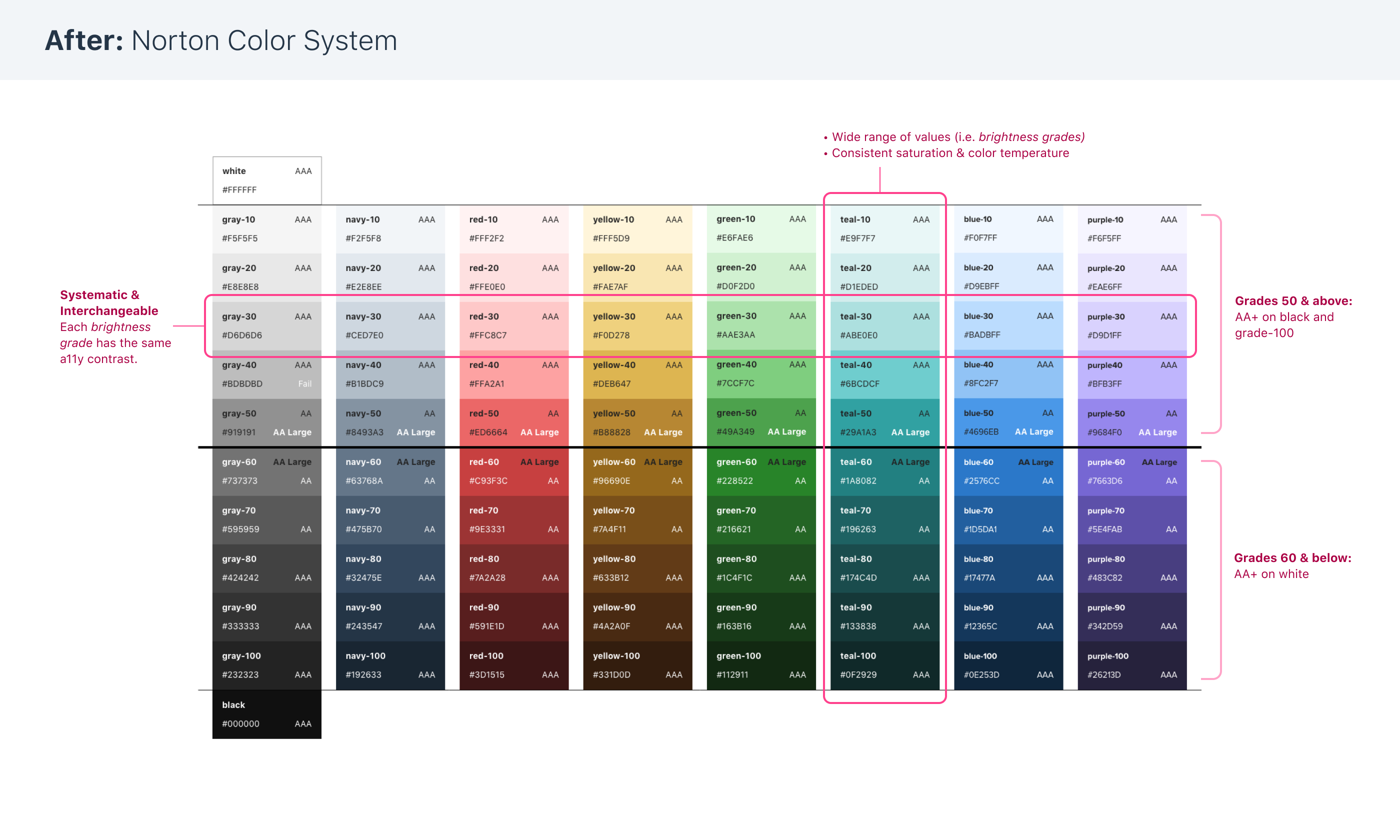
To sell to colleges and universities, ed-tech companies like Norton are required to comply with WCAG AA standards. Having a design system of our own lets us codify Norton’s a11y best practices and bake them into the design of our components.
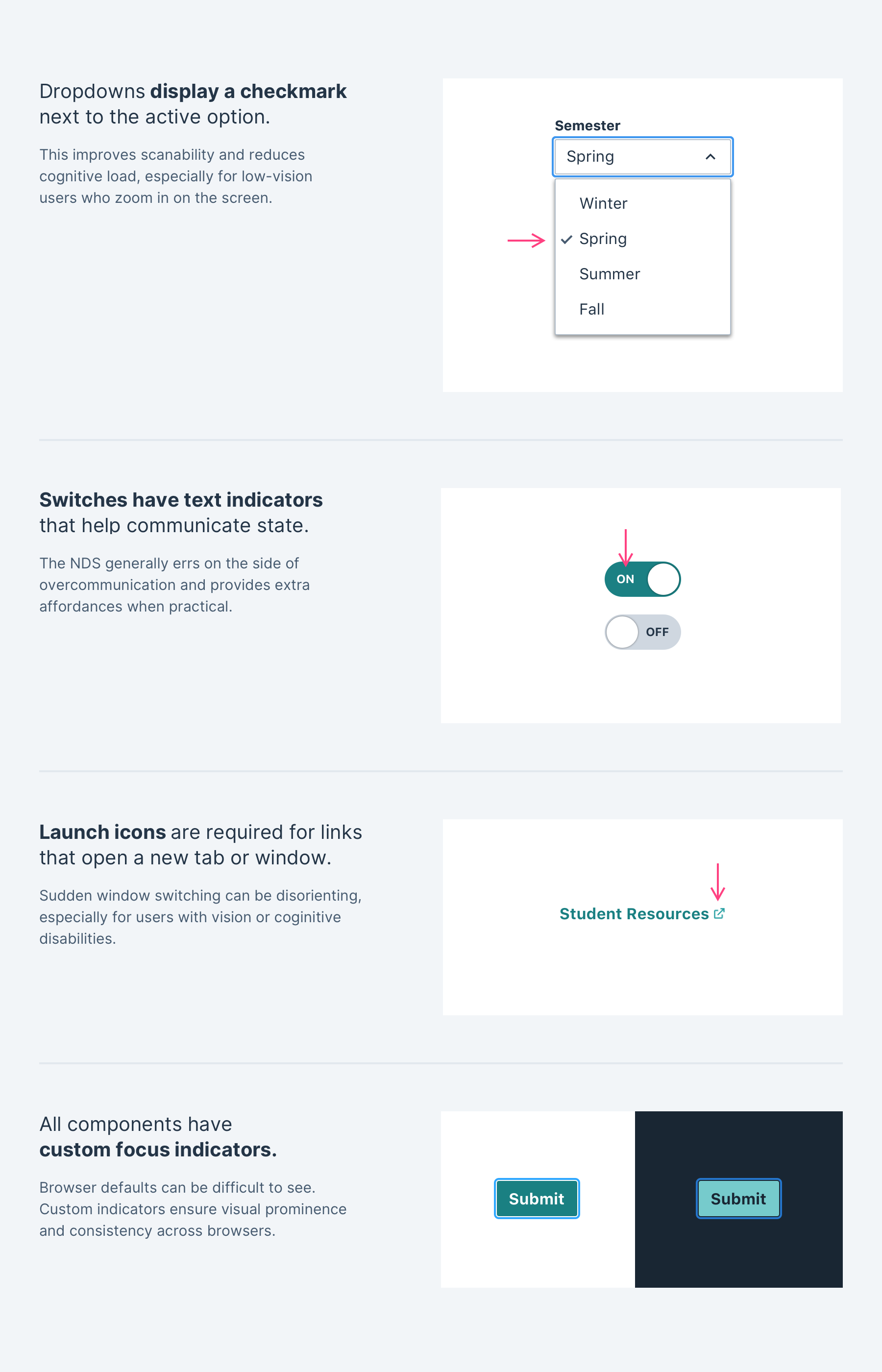
I adapted Norton’s fragmented color palettes into an accessible color system using a process created by Mineral UI.
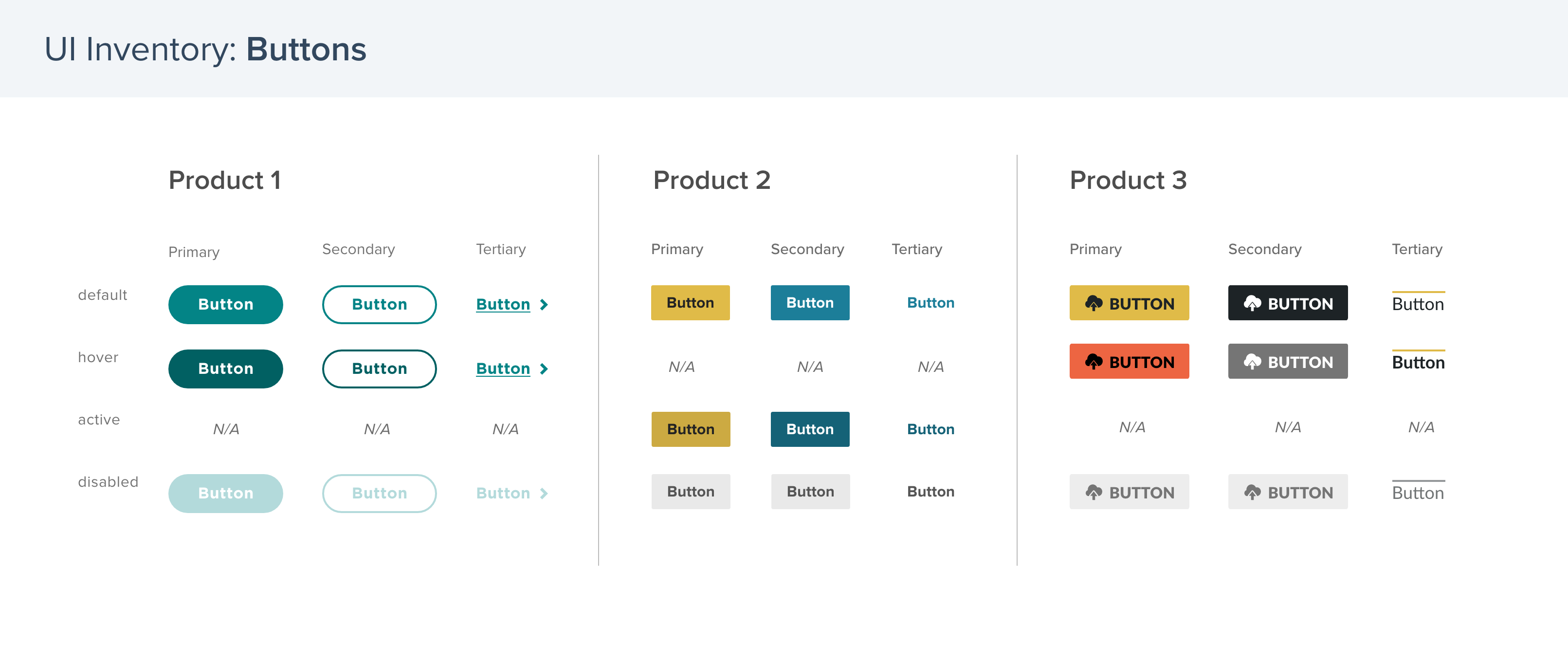
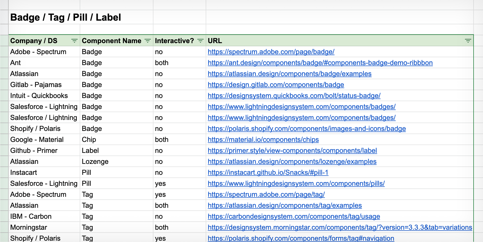
Design system analysis is key to our process. Knowing common mental models for an element helps us build something designers and developers will recognize.
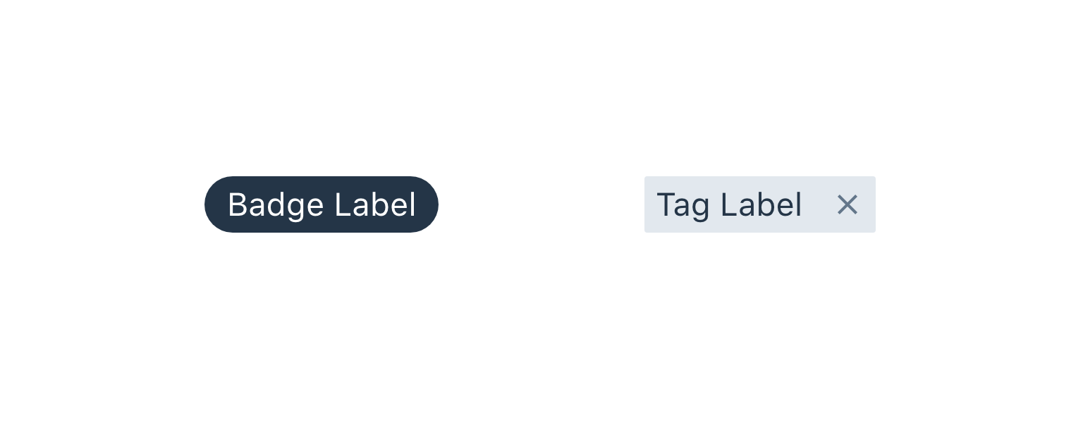
For example, we initially had trouble defining our Badge and Tag components (there are so many different names and uses for these elements in the UX world). Studying other design systems helped us articulate what we wanted in our version of the elements.
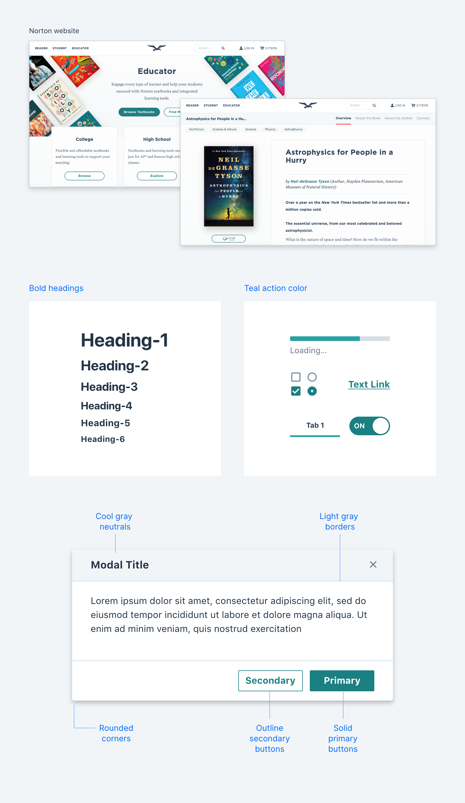
Norton had just gotten a brand refresh, so it was important to stakeholders that the NDS look on-brand. In my design work, I borrowed motifs from the newly-redesigned company website.