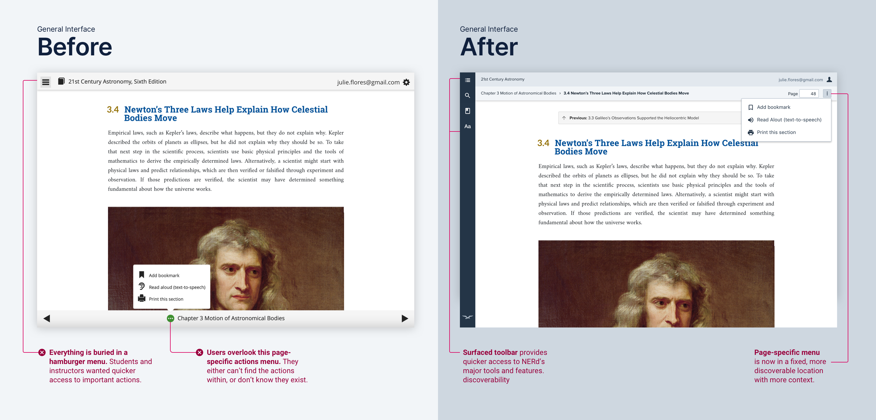
Quicker access to tools and navigation
Per customer feedback and usability test results, we ditched NERd’s hamburger menu and surfaced the main toolbar. Stakeholders were also on board, as they wanted NERd to feel like a learning workspace.
web app students use to read the digital version of their W. W. Norton textbook. It has over 1M annual users.
Norton Ebook Reader (NERd) is a web app students use to read the digital version of their W. W. Norton textbook. It has over 1M annual users.
Norton asked my team to redesign NERd from scratch, starting with the navigation. The goals were to:
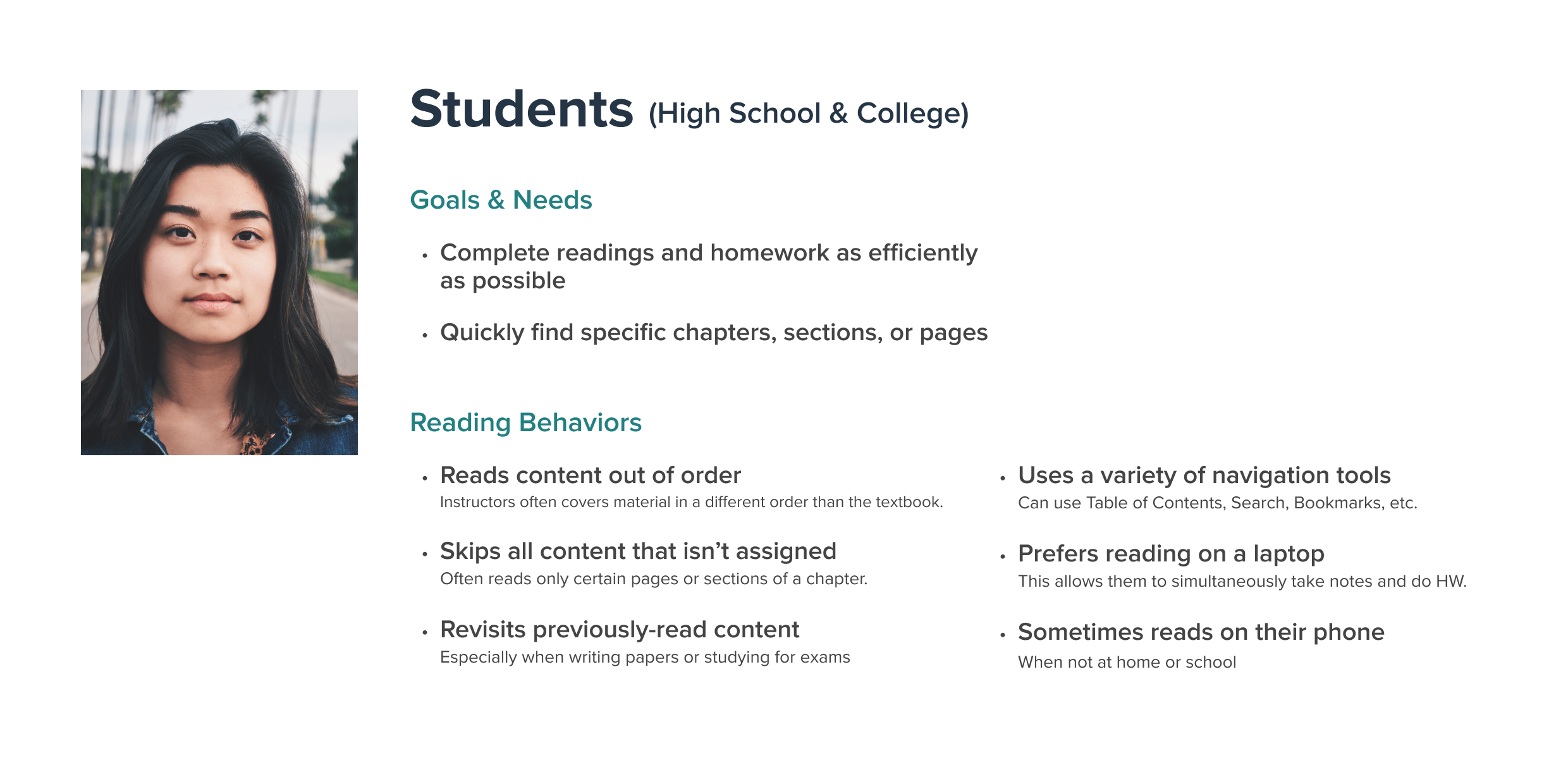
Textbooks have complex information architectures compared to standard novels and nonfiction books. NERd users also have specific reading habits and goals, relying heavily on navigation tools to find the content relevant to their coursework.
Per customer feedback and usability test results, we ditched NERd’s hamburger menu and surfaced the main toolbar. Stakeholders were also on board, as they wanted NERd to feel like a learning workspace.
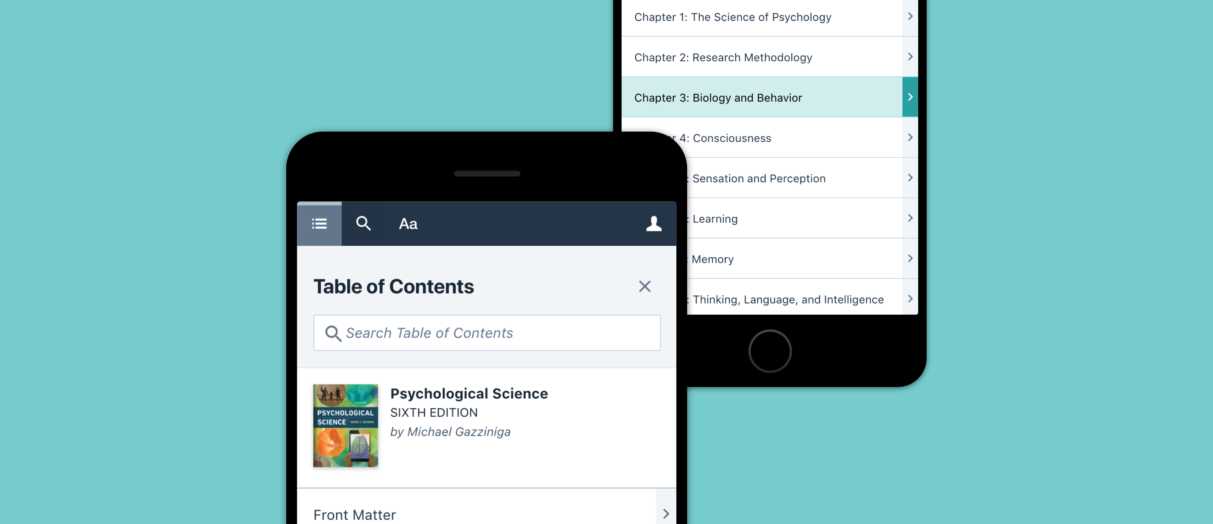
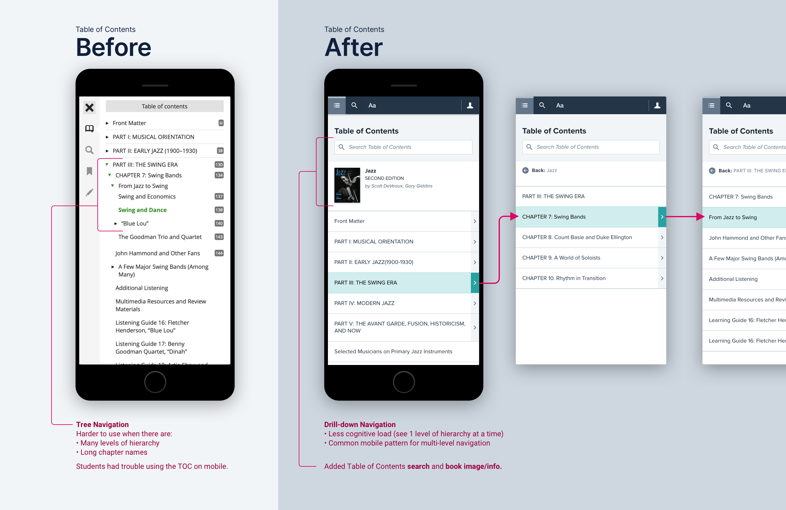
Textbook tables of contents (TOCs) are complex, having several levels of hierarchy and lengthy chapter names. Nomenclature also varies—some books are organized into parts instead of chapters.
This had many design implications. For the Table of Contents panel, it informed our decision to go with a drill-down menu instead of the original tree navigation.
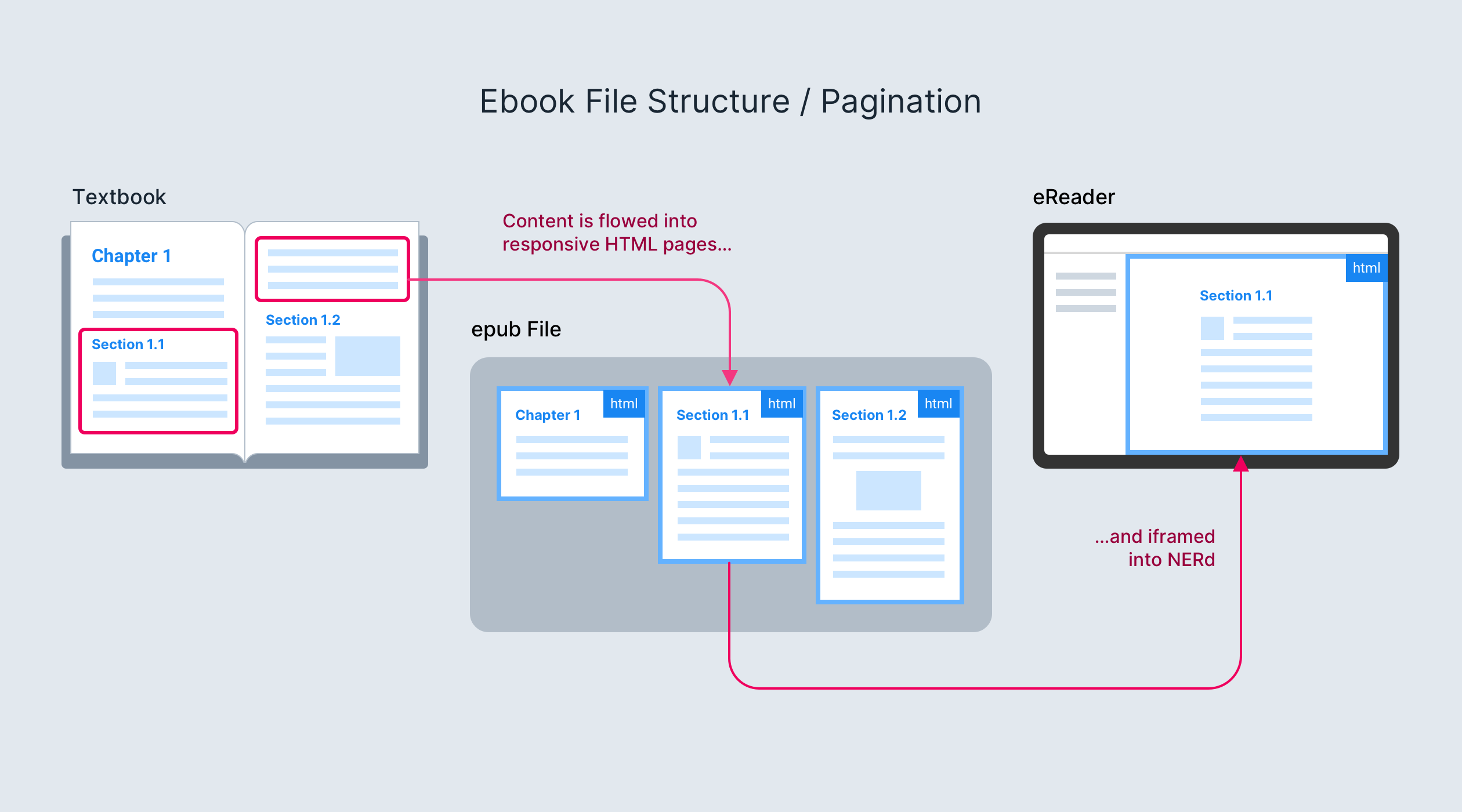
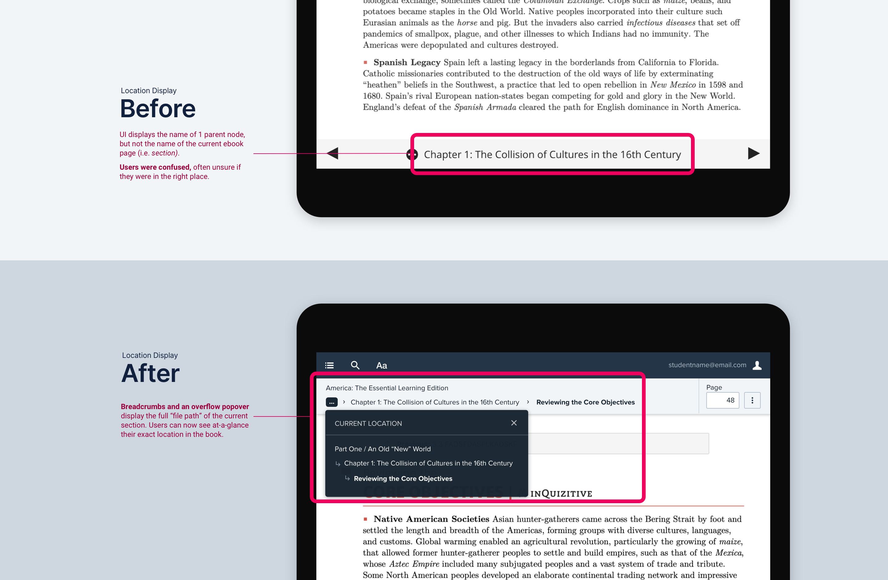
Norton ebooks break away from the print pagination mental model. They are structured like websites: each digital “page” corresponds to a node in the TOC.
Thus, users need to see their place in the book’s hierarchy to make sure they’re in the right place and reading the right material. Our new design's breadcrumbs tell users exactly where they are at-a-glance.
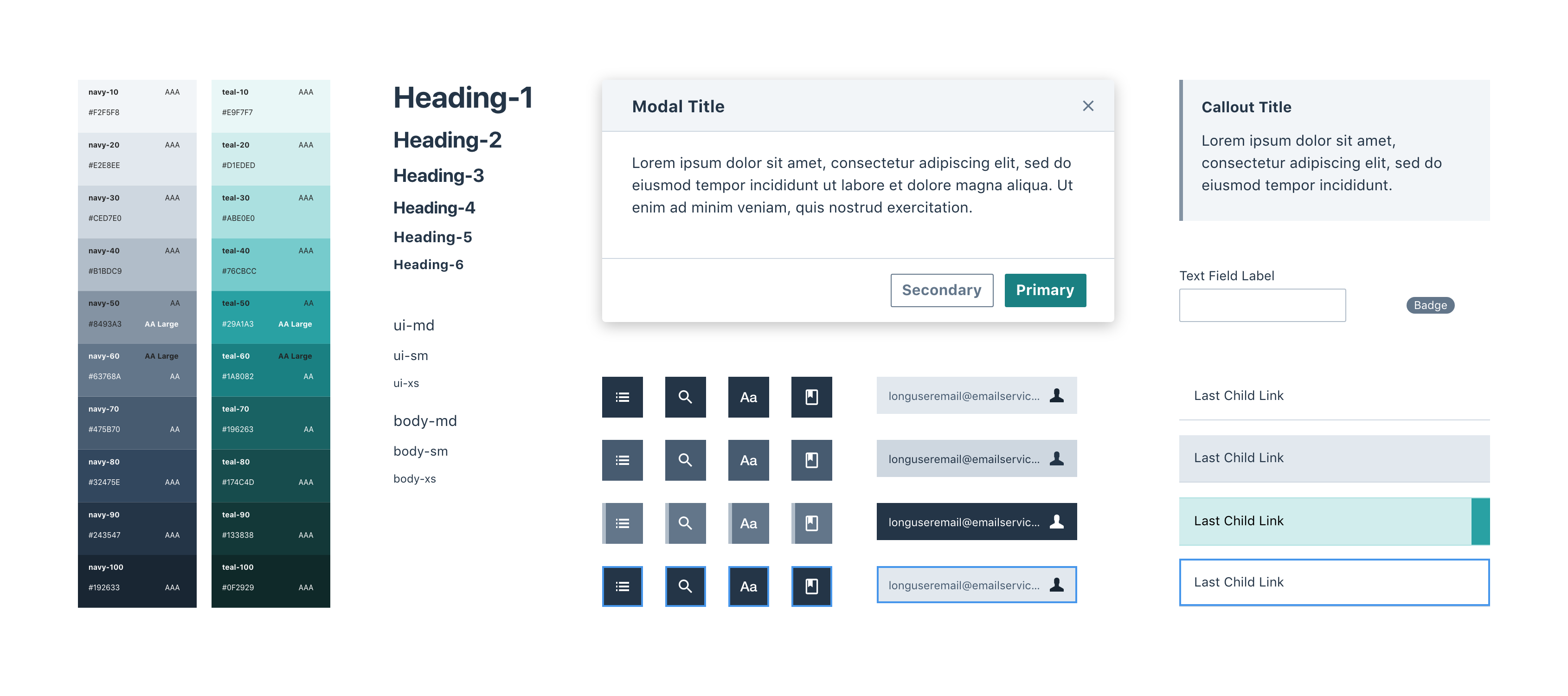
I designed the new UI using many components I previously created for the Norton Design System, giving the app on-brand visuals and resolving prior a11y issues.